Brand kit
The brand kit.
The logo, the wordmark, the colours, the type, and the rules that keep them from going wrong. Free to download, in the shapes you actually need. Take it if you are writing about us, working with us, or putting our name next to yours.
a brand kit for a writing company. mostly words, obviously.
The wordmark
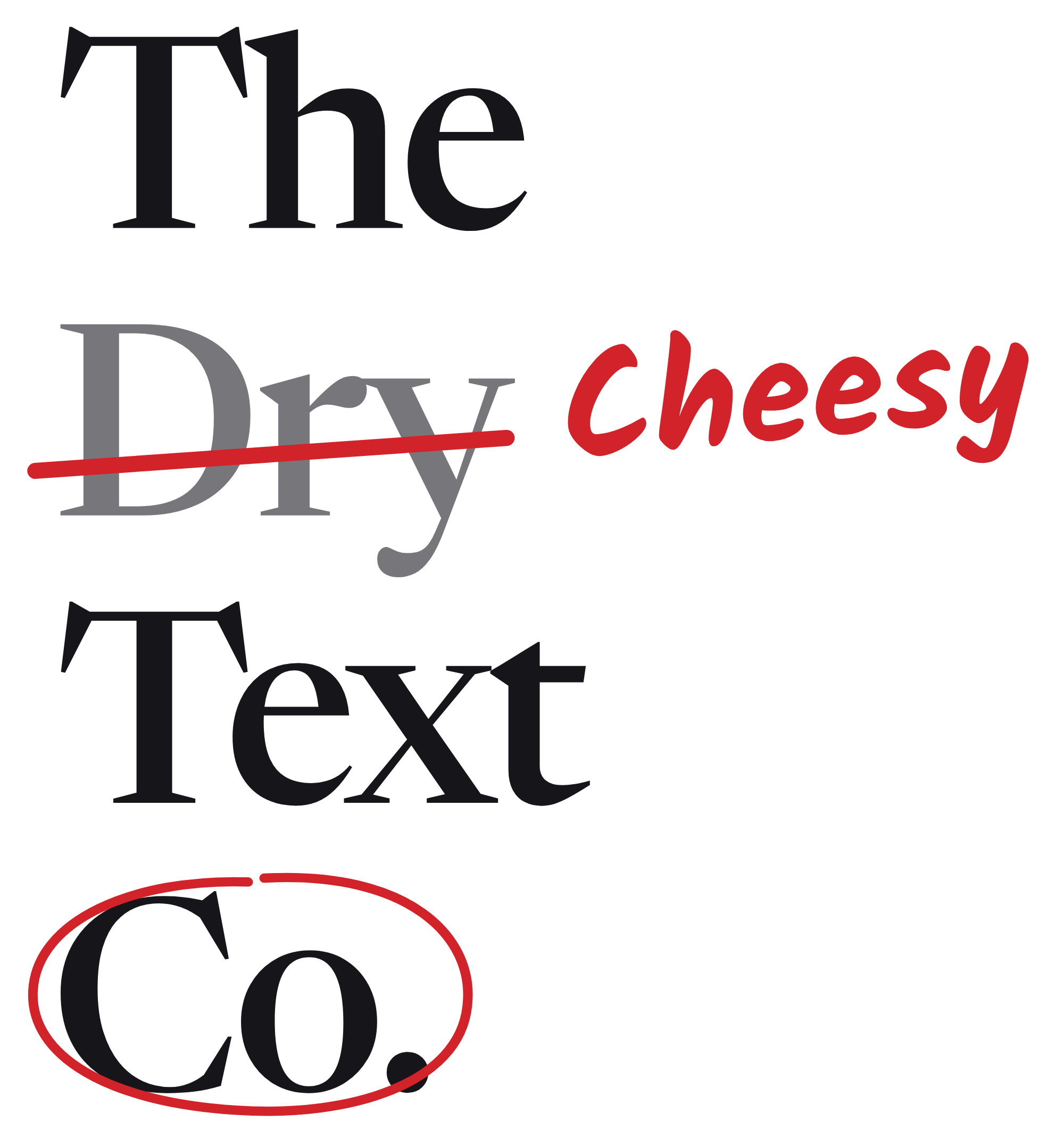
Two versions of the same name.
the edited one has to earn its space.

Edited · the landing page, deck covers, our own posts, printed cards. Never on red, and never under 120px wide: the handwriting turns to mush.
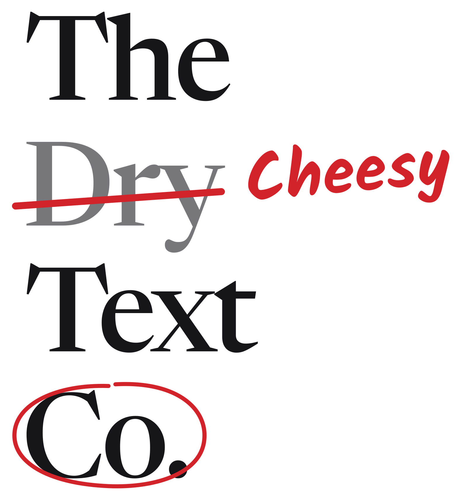
Edited, stacked · for tall spaces: a poster, a phone screen, the back of a card.

Dry · everywhere else. Proposals, invoices, contracts, email signatures, co-branding, stamps, embroidery, one-colour printing.
Edited SVGPNGPDFStacked SVGStacked PNGStacked PDFDry SVGDry PNGDry PDF
The mark
A proofreader's caret.
the mark that means: something goes here.








Colour
Paper, ink, and one red.
the red is for marks, never for backgrounds.
- Paper
#FBFBF9 - Ink
#16161A - Red pen
#D2232A - Margin line
#F2B8B8 - Highlighter
#FFE27A - Visitor blue
#2F5BD3 - Pencil grey
#77767A
Type
Three faces, one job each.
- Newsreader for everything you read. Print-shaped, made for long text.
- Kalam for the handwriting: our notes in the margin, and nothing else.
- JetBrains Mono for labels, dates, prices and small print.
- Noto Serif Gujarati when the words are Gujarati, which they often are.
NewsreaderKalamJetBrains MonoNoto Serif Gujarati
All four are open licensed. The licences ship with the files.
The book
Seven short chapters.
read 00 first. it's two pages.
- 01 Read meWhat the brand is for, and how to use the rest.
- 02 LogoThe caret: sizes, backgrounds, clear space, what not to do.
- 03 WordmarkEdited and dry, and which one goes where.
- 04 ColourThe palette, with the contrast numbers.
- 05 TypeThe three faces and the sizes they work at.
- 06 VoiceHow we write, including the jokes we don't make.
- 07 Interface and motionThe margin, the cursors, and how things move.